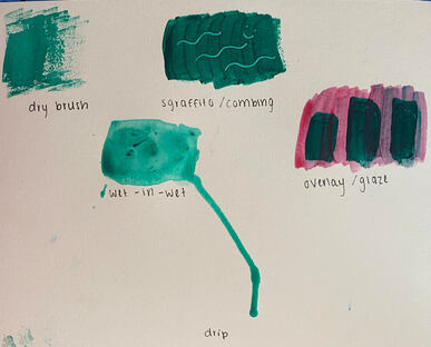
|
FFor this project, I painted a field of flowers that I took a picture of in France. At the bottom of the painting, you see rows and rows of small yellow flowers and behind the flowers is a small hill in the distance. For the flowers I started by painting the background a dark green. I then mixed yellow and white together to create the right colors for the flowers and I repeatedly made small irregular circles with my brush. The cloudy sky takes up the top half of the painting. For this I used different shades of blue grey mixed with white. At first the sky was too grey so I mixed linseed oil and a small amount of blue paint and painted that mixture over the sky to make it appear more blue. Painting with the oil paint was weird at first because I'm used to using acrylic paint. I liked that the oil paint didn't dry very fast because it was easier to blend the sky, however it was annoying when I way painting the flowers because I had to wait a long time for the background to dry. It was also not as easy to clean the oil paint off of my brushes compared to acrylic paint. Overall, I enjoyed oil paint and I think if I continue to practice, it will get easier. I decided to paint this picture because I thought it was beautiful and it is meaningful to me because I took the picture in France. I also love flowers and was looking for a landscape with flowers for my painting.
0 Comments
For this piece, I decided to paint a picture of a clock that I took while I was in Paris. Instead of painting it more realistically, I was inspired by the pastel colors used in the painting "The Rehearsal" by Hobson Pittman from the NCMA. I used a blue pastel color on the walls and a yellow gold color for the floors. Instead of making the people in the foreground more detailed, I painted their silhouettes and used light pink, grey, orange, and yellow. The clock in the painting was actually a window, so I used blue and white to create the sky and yellow and green to create the buildings and the grass that could be seen from the window. I also used cream colored paint for the details on the clock. Although the walls in "The Rehearsal" were very textured, I decided to make mine smooth. I also tried to emphasis the clock by making it the focal point of the painting. I think the bright pastel colors in this painting convey a joyful and fun mood. The colors depict an exciting and happy day in Paris. Even though the colors in my painting don't perfectly match the shades used in the NCMA piece, I'm very happy with how my painting turned out. I love how playful the theme is and how pretty the colors turned out. This painting is one of my favorite pieces that I have made in Art 3 so far. 1. Colors- In this piece, the artist uses a lot of blue, yellow, orange, and pink. This piece follows the square color scheme. 2. Texture- The people in this piece appear to have a smooth and soft texture while the floor has a smooth and hard texture and the wall appears to have a hard, bumpy, and rough texture. 3. Subject- In this piece, there is a large group of people standing together in a room. Many of them are holding a small book/ a piece of paper. 4. Meaning- Although I couldn't find the meaning of this particular painting, I discovered that Pittman grew up in a very religious household due to his mother being a devoutly religious woman. This painting might depict a group of people attending a church service and Pittman may have been influenced by his mother/ his childhood when creating this piece. 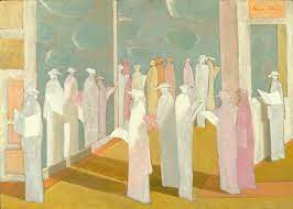 -Hobson Pittman -The Rehearsal -1966-1967 - 30 x 42 in. (76.2 x 106.7 cm) -Oil on board - A group of people in a room, most of the people are wearing hats, many of the people appear to be flat against the wall, the people are also holding pieces of paper. - I was drawn to this piece because of the beautiful pastel colors.  For this project, I made a piece that incorporated thorns and roses. On the first linocut block, I sketched a few thorn branches using a pencil and then cut out the branches. On the second linocut block, I used a pencil to sketch some roses and then used a tool to cut out the background around the roses. I then rolled orange ink onto the rose linocut block and blue onto the thorn linocut block. Finally, I transferred the pattern onto a sheet of paper. Because I cut out the thorns in the first linocut, they were white and the background was blue on the paper. On the second linocut, the roses were orange and the background was white because I cut out the background and left the roses on that block. I used contrast in my piece by incorporating thorns (seemingly dark, evil, and painful) and roses (known for being beautiful and representing love). Although roses and thorns are different, they still represent the theme of this project because they are often associated with each other in both a symbolic and literal sense. I really like the way that my piece turned out and I think that it was successful. However, if I had to change anything I would make the thorn branches skinnier. I drew a photo of myself that I took on my first day of in person school. I think it's a good photo to represent my 2021 self because I hadn't been in the school building for classes in almost a year and I was wearing a mask in the photo which represents current events. In this piece I used lots of brown, black, purple, green, yellow, red, white, and peach throughout. I used the gridding method to ensure all of my proportions were correct and for the scale I used one full page of my sketchbook. I tried to show the texture in my hair and mask in this piece, although it was one of the most challenging parts of the project for me. Going into this project, I was hoping that my portrait would look realistic. While I do think it looks somewhat like me, I dont think my style was as realistic as I was hoping it would be. There are many parts of the drawing that aren't perfect but I kind of like it that way and I think it shows my voice as an artist. I think I did a good job drawing the shirt, the mask, and the skin. If I was to do this project again, I would change my hair and my eyes. I don't think that they turned out very good and those are the main things that make my piece look less realistic. Overall I am happy with my piece and think I did a good job on my first color pencil drawing project! In my still life I included a Nirvana record, a cake stand, and two books. I decided to choose items that represented my life during lockdown this past year. The cake stand represents all of the baking that I did. I learned how to make french macarons and perfected my chocolate chip cookie recipe. I included books because I read a lot to pass the time and a Nirvana record because my brother introduced me to some old rock music and I was constantly listening to it. I used these items in my still life because I think they represent me and they are all things that I still love even though lockdown has ended. For my piece I used prismacolor pencils. I wanted to have my piece be more colorful and I had never used prismacolors before so I was excited to try. When creating this piece, I used the cropping feature on my phone to divide the picture into nine different sections. As a result, I think my piece follows the rule of thirds. Overall I do think my drawing is a good representation of me because I included some of the things that bring me joy. |